Hey Everyone! Do you love a good pop of color? I sure do! In my own home I prefer to keep my walls neutral and add in pops of color in my furniture and home decor. Currently I have a small washstand in my living room and a beautiful antique hutch in my dining room that are a pop of teal! (Check it out below)
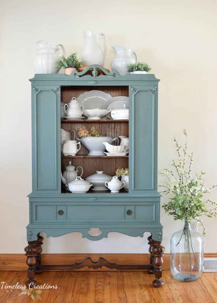
Isn’t she pretty? (See the full hutch makeover post HERE) Such a pretty focal point in my dining room. Whether a large piece or small there’s always somewhere to add in that Pop of color as long as YOU love it, it is always worth it. The brand we prefer to use on our furniture we paint in store or for ourselves is Fusion Mineral Paint. Fusion has a full range of absolutely gorgeous colors. Some amazing neutrals too, don’t get me wrong, but the COLORS are just amazing!
While neutrals are a safe choice, we are really drawn to some of those bold and beautiful colors. Below are just a few examples of some of our favorite Fusion Mineral Paint bold colors we have used recently. Check it out and be sure to let us know which Fusion bold COLOR is your favorite!
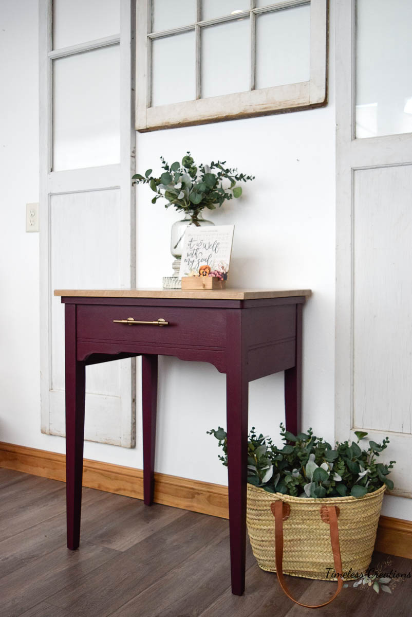
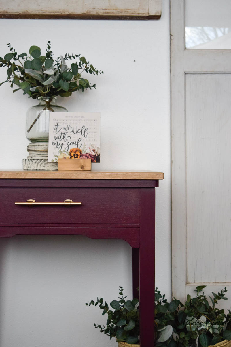
A vibrant yet sophisticated purple, this shade brings a moody and deliciously calculated drop of color into any space.
Pair with Lamp White for a contemporary twist.
Pair with Eucalyptus for a pop of personality.
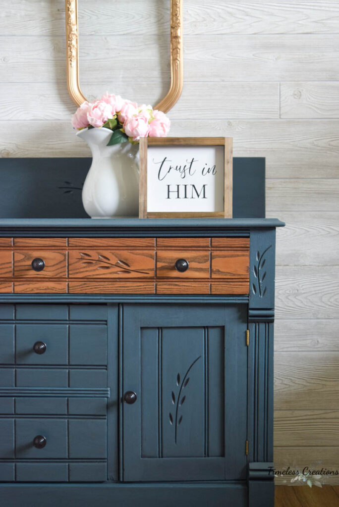
Homestead Blue with Ash mixed into Clear Glaze
As one of our most iconic shades, Homestead Blue has stood the test of time.
A complex blue with a hint of grey and an undertone of teal, it adds charm and confidence.
Pair with Buttermilk Cream for a luxurious look.
Pair with Cathedral Taupe to add softness.
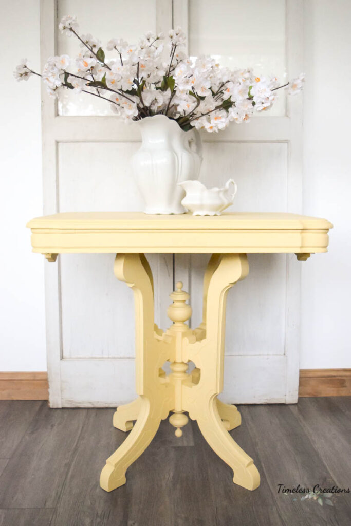
Just as the name indicates this is a warm soft creamy yellow. Goes nicely with greens, grays, reds and black.
Pair with Champness for a farmhouse feel.
Pair with Bayberry for a bold look.
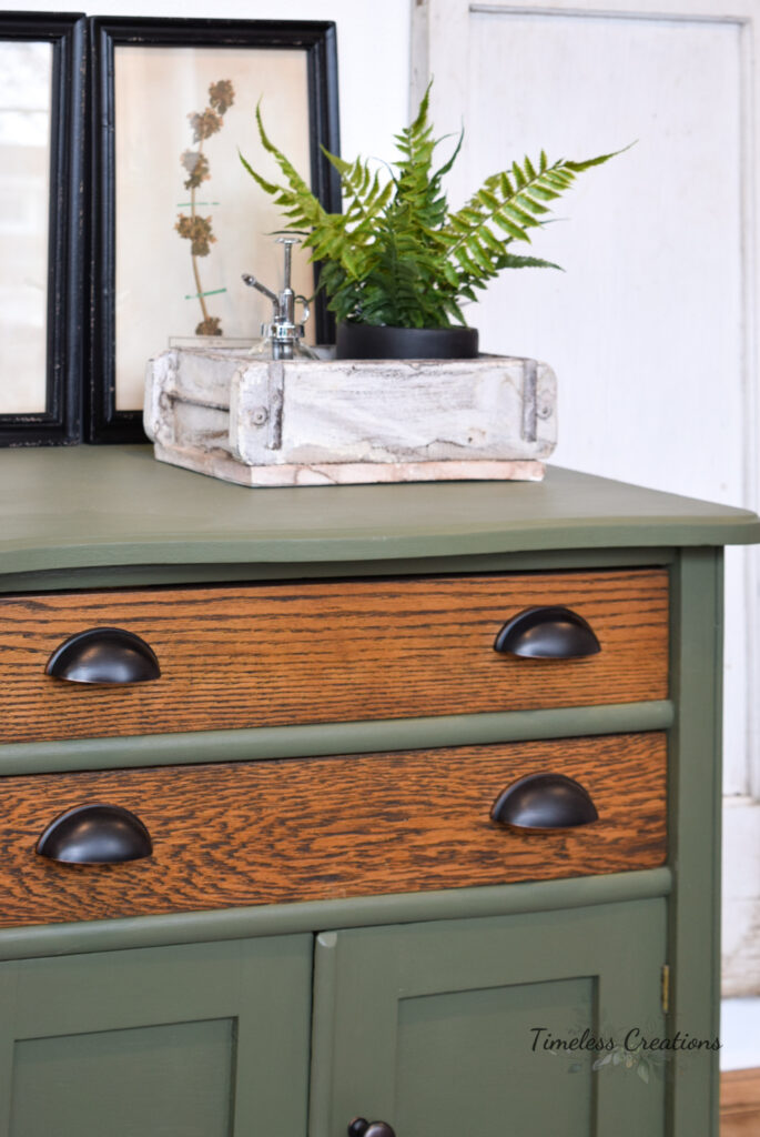
A deep muted olive green, vintage in nature. Stunning on its own or accompanied.
Pair with Bedford for depth and drama.
Pair with Plaster for a rustic, seasoned feel.
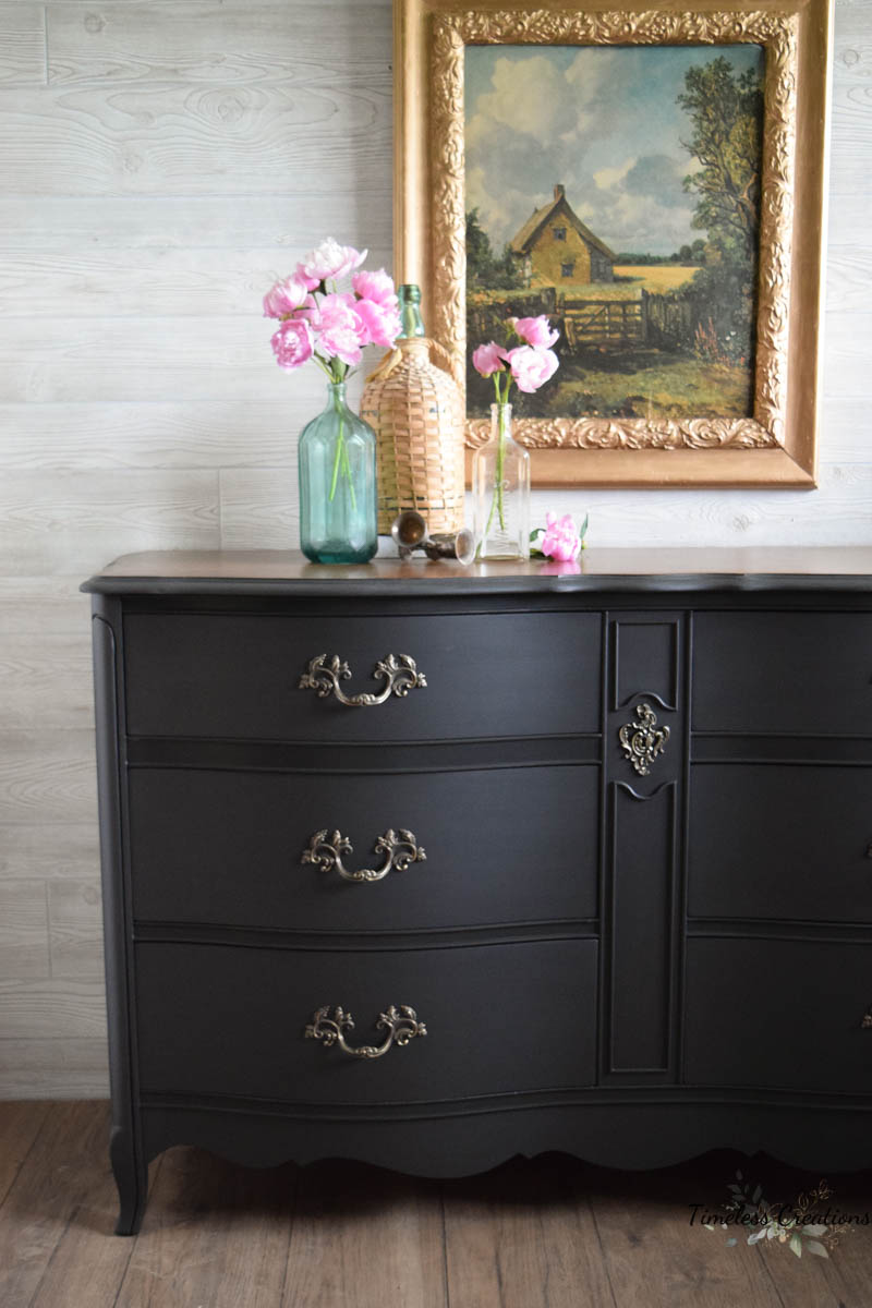
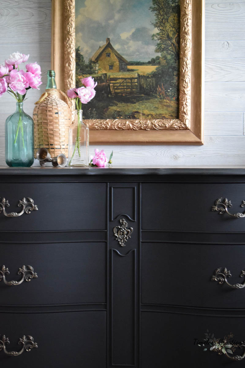
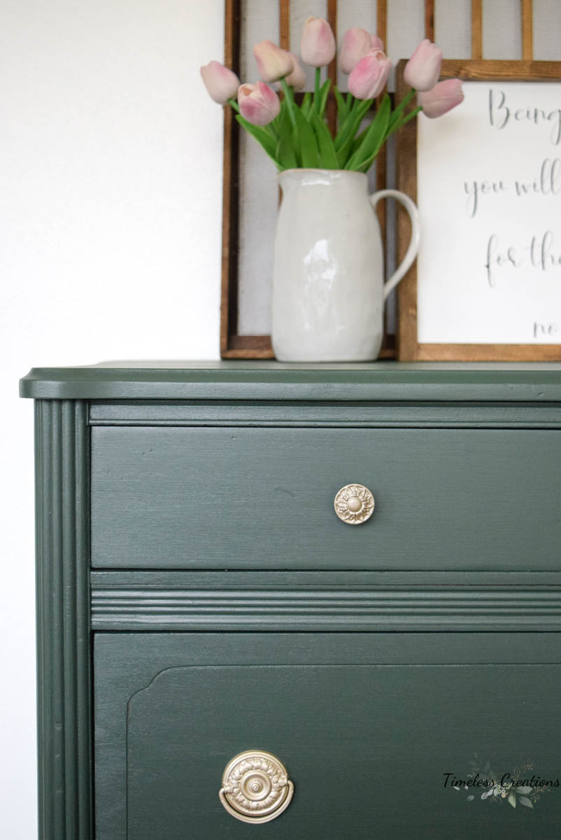
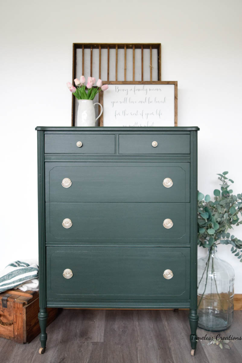
An opulent, deep green inspired by traditional homes and landscapes. This saturated shade leans confidently into its black undertones and has lived in historic beauty that will be loved for centuries more.
Pair with Ash for powerful flair.
Pair with Hazelwood for an earthen statement.
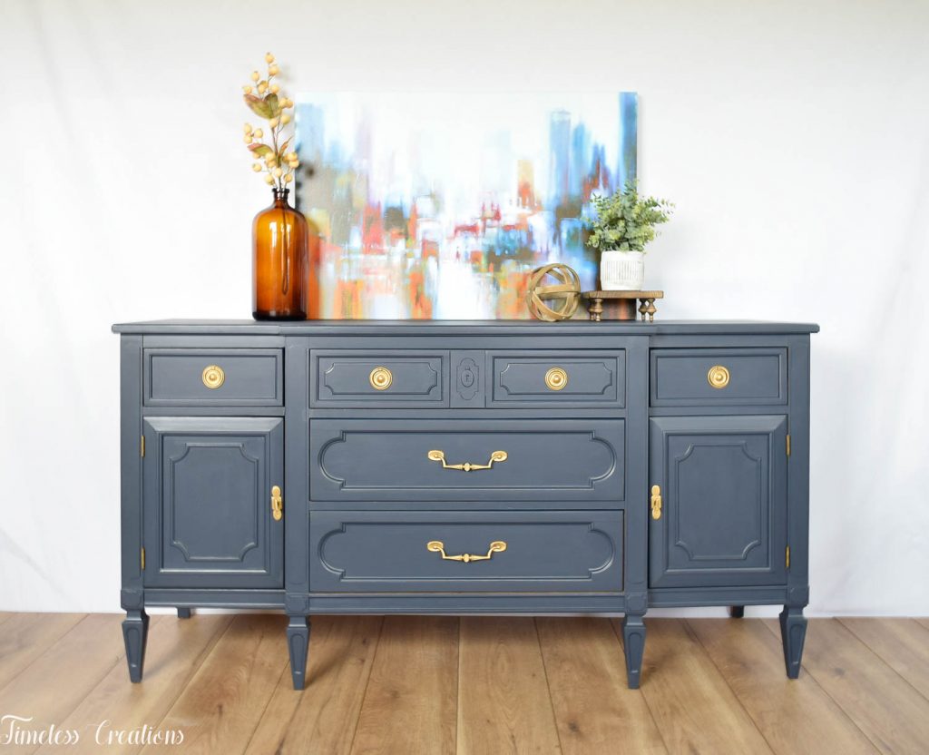
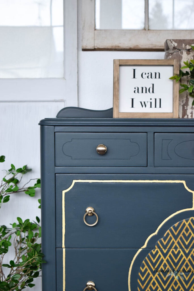
This on trend rich dark blue on the edge of black is bound to make a statement and enrich any piece.
Pair with Sterling for a modern feel.
Pair with Raw Silk for a classic contrast.
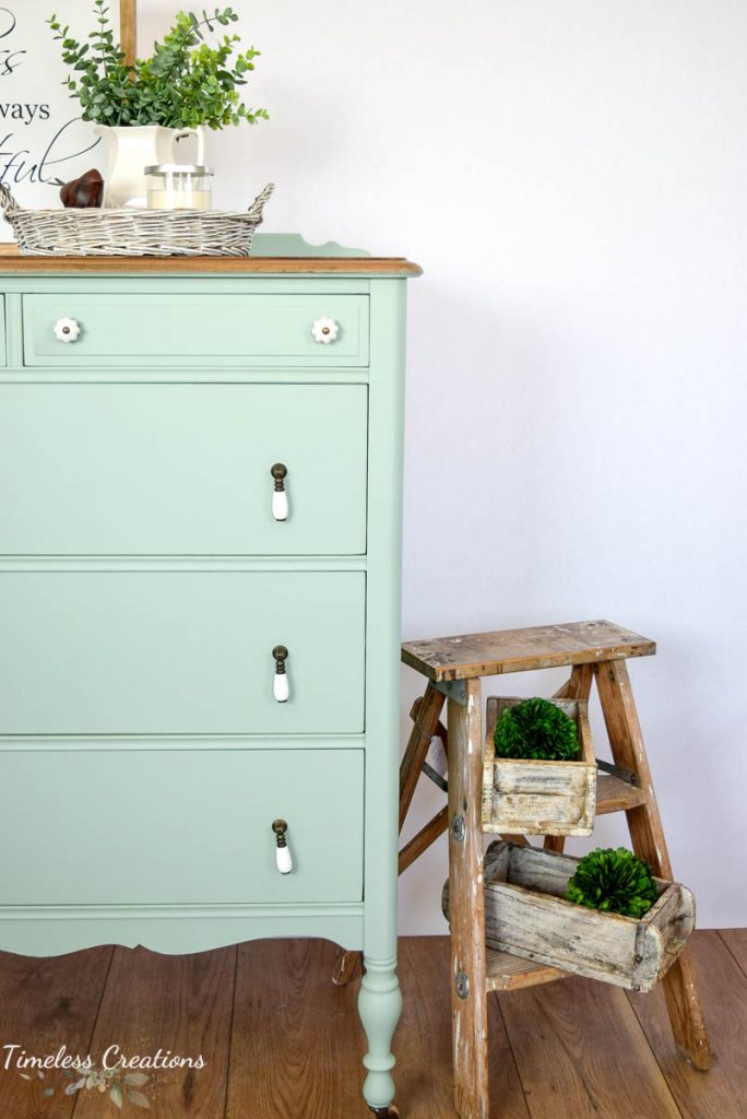
Dip your toes into this refreshing watery blue-green.
Pair with Buttermilk Cream for a pop of color.
Pair with Limestone to create a light and airy feel.
Enchanted Echinacea (discontinued color)
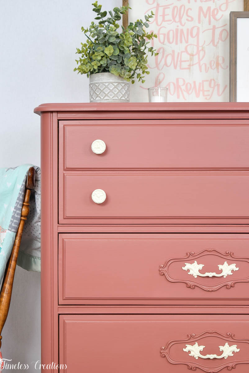
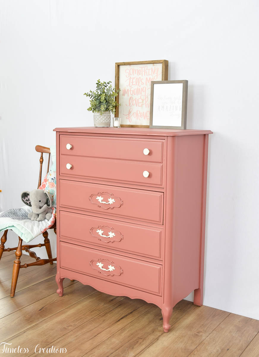
Created to mimic the heart of the echinacea flower, this rustic rose hue is bursting with warmth and vibrancy. Ideal for those who are looking for an elemental, nature inspired color.
This color as been discontinued as it was a limited release color collaboration from Fusion, but I had to add it into this beautiful bold color post as it is just gorgeous! If you have the Fusion Fan Deck the closest color recipe I can find is Color Recipe # 51 “Dusty Rose” of equal parts Cranberry and Prairie Sunset. You could add just a tiny bit of Cast Iron to the recipe to deepen the color a little bit. (Just a tiny bit!)



Leave a Reply